Item
A Telling Graph...

Media
Title (Dublin Core)
A Telling Graph...
Description (Dublin Core)
This graph illustrates unfortunately the differences in the handling of the Pandemic. When I created this I chose six industrialized nations They have a total of 346 million residents, according to Google. Also according to Google the United States has a population of 331 million residents. Five of the six nations appear on the graph below the figure for the United States. Taiwan did not have enough cases despite a population of 23.5 million to register on the bottom of the graph. So that is six industrialized nations for 77 thousand deaths versus 200 thousand deaths in the United States alone and growing at the world's fastest rate of infection. This is important to me because it illustrates the failure of our government to take the Pandemic seriously enough.
Date (Dublin Core)
Creator (Dublin Core)
Contributor (Dublin Core)
Event Identifier (Dublin Core)
Partner (Dublin Core)
Type (Dublin Core)
PDF
Link (Bibliographic Ontology)
Source (Dublin Core)
The Financial Times
Controlled Vocabulary (Dublin Core)
Curator's Tags (Omeka Classic)
Contributor's Tags (a true folksonomy) (Friend of a Friend)
Collection (Dublin Core)
Linked Data (Dublin Core)
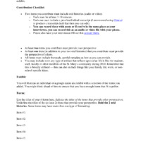
Exhibit (Dublin Core)
#CoverYourFangs>Staying Safe
Date Submitted (Dublin Core)
11/11/2020
Date Modified (Dublin Core)
11/11/2020
07/16/2021
28/09/2021
This item was submitted on November 1, 2020 by Christopher Metta Bexar using the form “Share Your Story” on the site “A Journal of the Plague Year”: https://covid-19archive.org/s/archive
Click here to view the collected data.