Item
Pennsylvania COVID-19 Cases Graph
Title (Dublin Core)
Pennsylvania COVID-19 Cases Graph
Description (Dublin Core)
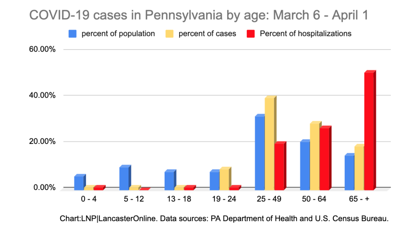
Graph shows the percent of population in blue, percent of cases in yellow, and percent of hospitalizations in red for cases in Pennsylvania. All the bars from ages 0-24 are quite low in all three categories. However from ages 25-65+ increase in all categories. The percent of hospitalizations rises drastically for ages 50-65+. While their percent of population and percent of cases are low they are the age group more likely to need hospitalization.
Date (Dublin Core)
Creator (Dublin Core)
Event Identifier (Dublin Core)
Partner (Dublin Core)
Type (Dublin Core)
Image of bar graph showing cases of COVID-19 in Pennsylvania
Link (Bibliographic Ontology)
Publisher (Dublin Core)
LancasterOnline
Controlled Vocabulary (Dublin Core)
English
News coverage
English
Public Health & Hospitals
Curator's Tags (Omeka Classic)
Contributor's Tags (a true folksonomy) (Friend of a Friend)
Collection (Dublin Core)
Date Submitted (Dublin Core)
11/06/2020
Date Modified (Dublin Core)
11/24/2020
02/17/2021
07/06/2023
This item was submitted on November 6, 2020 by [anonymous user] using the form “Share Your Story” on the site “A Journal of the Plague Year”: https://covid-19archive.org/s/archive
Click here to view the collected data.